SOVIET PROPAGANDA ART THROUGH THE YEARS

During Fall semester of 2023 in University of Pennsylvania I’ve worked as an artist on the group project with my peers. The class was called Cinema and Socialism and was lead by professor Julia Alekseyeva. Me, Jacqueline Cohen and Zach Siswick decided to experiment with how “The Cranes Are Flying” film would look like in the Soviet Past, how different it would be in our Present and even how they might look in the Future. I designed three movie posters in total: Past, Present and Future, each of them with their own unique approach. In this post I will walk through them, and the inspiration behind.
PAST
Sketch
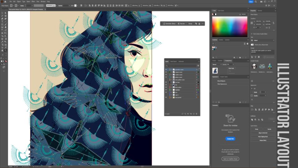
Sketch on the left was done by hand in Procreate and then exported to Adobe Illustrator, to be done in vector. The poster in screen-print friendly, meaning that layers of it can be almost directly used as negatives in screen printing process.
Why screen print? It was one of the main ways to print movie posters at the time when “The Cranes are Flying” film was released. And being a screen printmaker myself, I hope to one day bring this poster to life. Image went through many color alterations and I believe still can be improved.

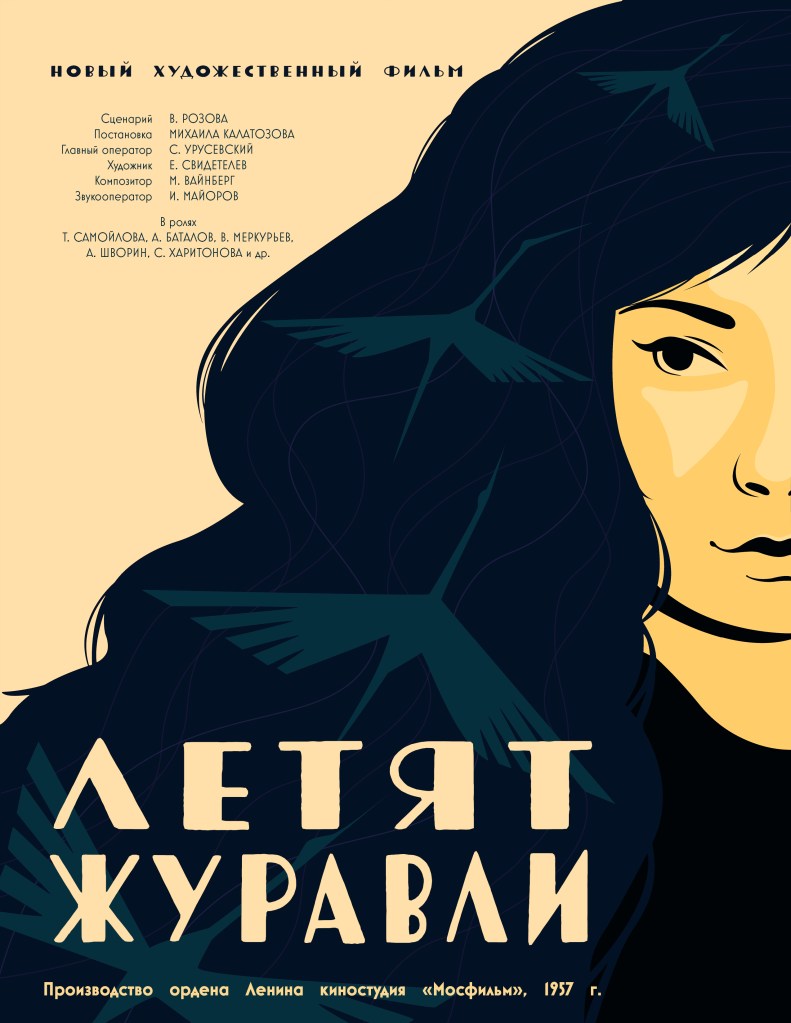
Cranes
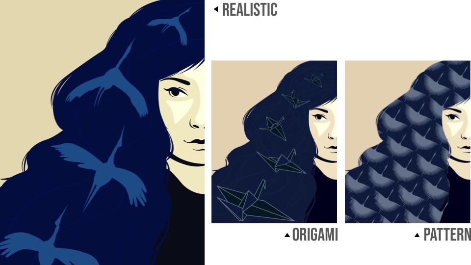
Before arriving at the final decision, shapes of cranes on the hair had in total 4 alternatives.
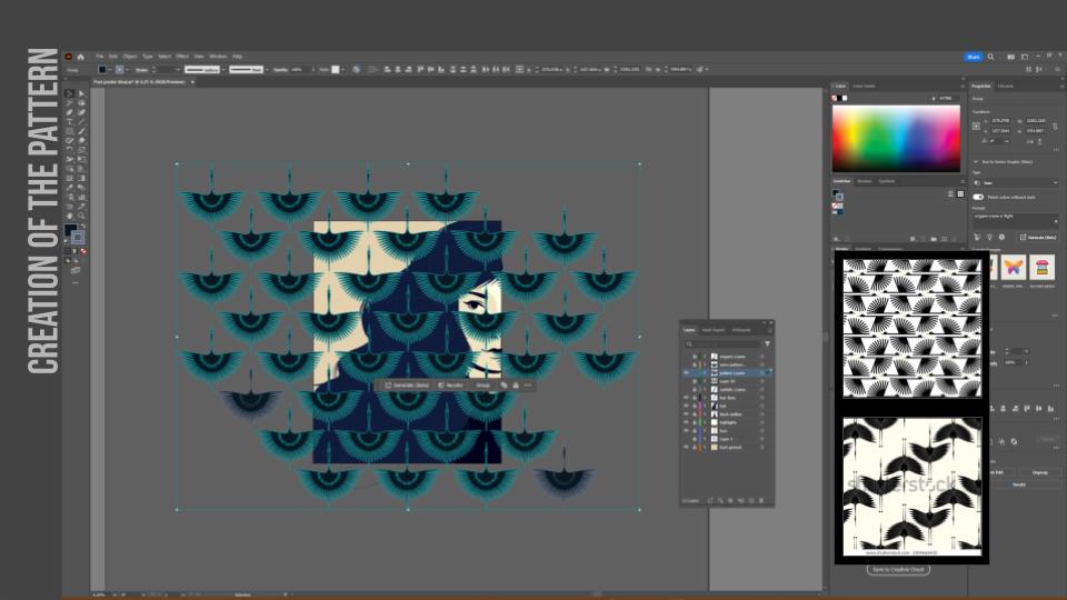
In the process of looking at the pictures of cranes to see how they can be simplified, the idea of origami cranes came into being. And while looking at the origami cranes I discovered a similar pattern for fabric and so many variations of it, so I created my own version of the pattern and used it in one of the versions. This pattern is now used for the cover for the whole project.
It started with more simple closer looking to a real cranes, than it was decided to try to make them more angular to fit better with general theme of posters in Soviet Union. And that design choice made it to final image.
Inspiration & Composition
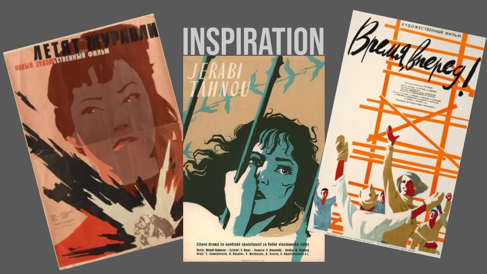
I used many Soviet movie posters for inspiration for this piece. They are made of bold colors, don’t have heavy outlines and instead relay on color contrast, while still using limited color pallete. Creative influences were the more modern movements like Cubism and Futurism, rather than traditional Russian art. Often colorful and illustrated in an appealing playful manor. [Image 1]
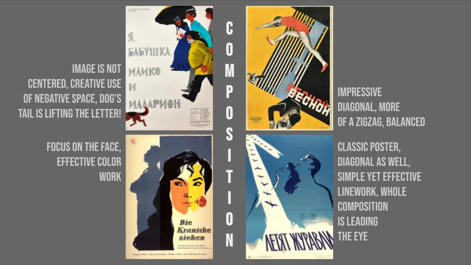
Composition was heavily influenced by movie itself, were scenes were shot diagonally. [Image 2]
PRESENT
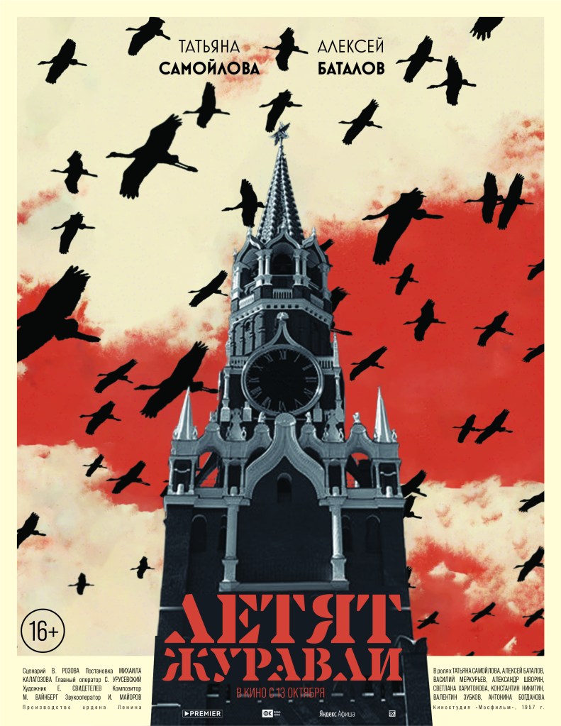
Sketch
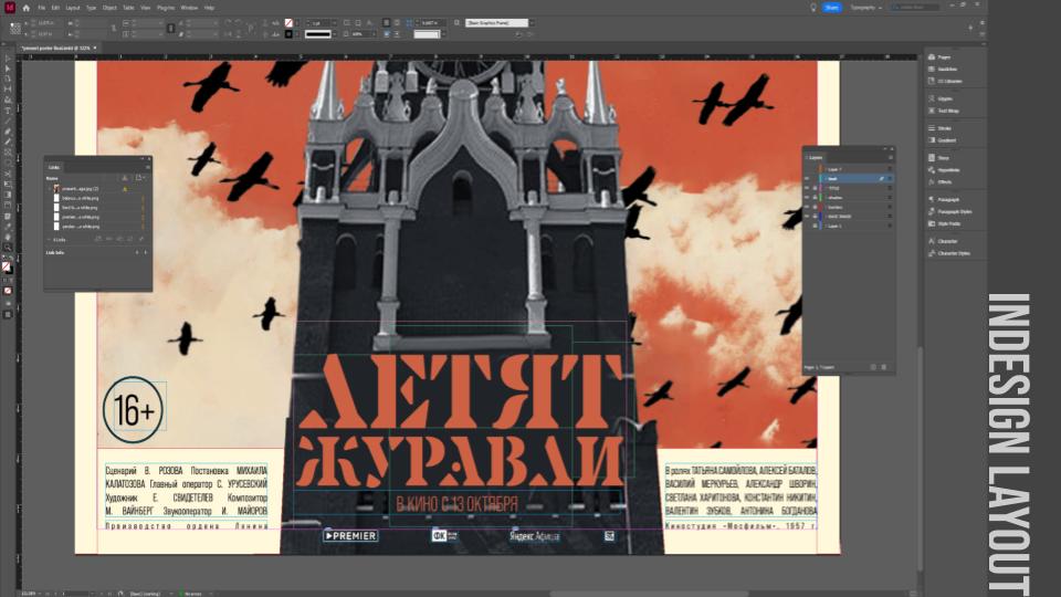
It started out as digital hand picked collage with Spasskaya tower in the middle and black silhouettes of cranes covering red sky. There’s no time on the clock of the tower, as if time stopped or doesn’t exist. A moment before storm or a moment after catastrophe, it symbolizes both and both are represented in the movie.
I tried cranes in white, as if they were cut out of the poster, and in black, more ominous. Black proved to be better- they stand out but don’t overshadow the main subject, although I had to make them smaller and increase their quantity in order to increase eerie feeling.

Inspiration
Inspiration came from contemporary movie posters in Russia in terms of text layout and I noticed how red is very popular color to use. Some of the common features are actors names being displayed on top, title of the movie usually towards the bottom of the poster, and one interesting feature is list of all sponsors at the bottom and, if they have, awards at the top.
FUTURE
Sketch
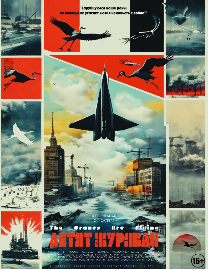
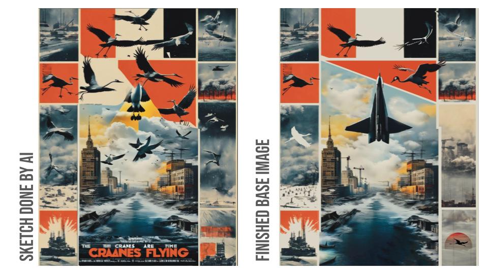
The AI sketch was glued together of 3 different generated pictures. They all were generated on my prompts that were inspired by real pictures from inspiration section below. The finished base image is ”collaboration between human and AI”. I used AI heavily to generate and regenerate certain parts, but still had to do a lot by hand to get everything in order and recognizable. The idea was that I use only generated, not real images, to represent something that didn’t happen or didn’t happen yet- meaning in the Future.
Nonetheless most images carry meaning in them. On top of the final image two cranes – the left one looks recognizable and natural, while the right one is metallic, robotic like, to represent humanity’s shift from nature to machine. The rise of Al in all industries turned that metallic crane towards us, to bring whatever this future holds, much faster than we expected.
The plane-like structure shares the sky with the birds, and AI decided that “cranes” means “construction cranes” so it used this imagery heavily, while I embraced it.
Two swans in the top right corner represent love between two main characters Veronica and Boris, it depicts the scene from the movie where main character was shot. No blood is shown, but rather smoke coming out of wound like from the firearm, bending the frame.
On the left side I was able to use the imagery of “cut out crane” with cemetery below to represent the innocent lives lost in war.
Other pictures show what AI thinks of the future, destruction and rebuilding, fire and snow. Themes that contradict each other, endless possibilities of inevitable future.
Inspiration
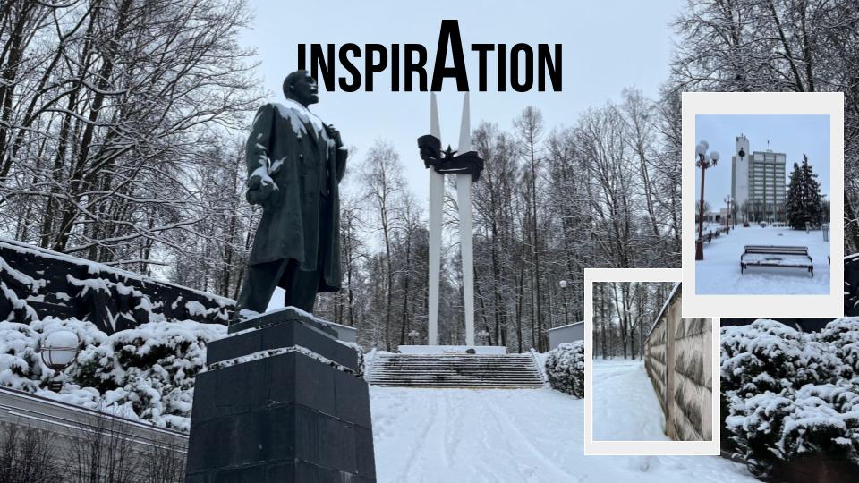
Inspiration came both from the past and present. My native city, Maladzyechna, still has a lot of Soviet time architecture, and now we can see how passage of time treated it. My friend took these picture in December 2023, when city was covered in snow – lifeless and disturbing enough for me to envision the theme.
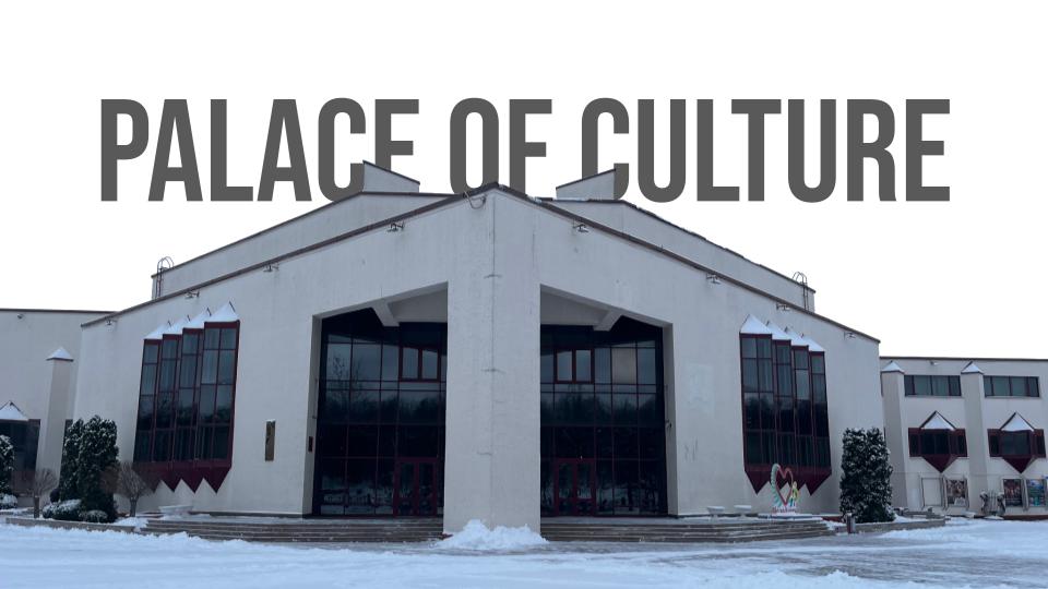
The Palace of Culture inspired the divided layout of the poster. Many rectangular windows on top of each other, pointy, quite dirty, lifeless and covered in snow. In the black reflection the reality is disrupted. Very imposing building.
Anatomy of posters
Publication
In spring 2024, I was honored to have my project published in TROIKA, the Undergraduate Journal in Eastern European, Eurasian, and Slavic Studies at UC Berkeley. My artwork was also featured on the covers. The publication is available for free on their website, and I’ve attached the PDF of the issue here for reference.
